
In the fast-paced digital landscape, where online shopping continues to thrive, having an e-commerce website that delivers an exceptional user experience across various devices is paramount. This is where responsive design comes into play. In this blog post, we’ll explore the benefits of responsive design for e-commerce websites and how it can revolutionize your online business.
Seamless User Experience
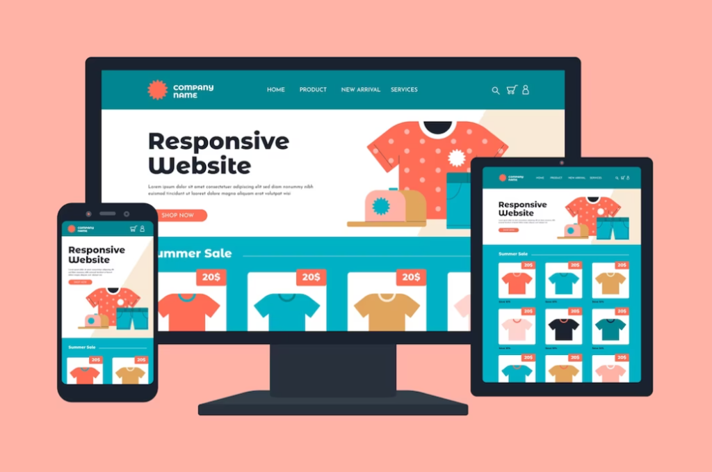
Responsive design ensures that your e-commerce website provides a seamless and consistent user experience, regardless of the device being used. Whether customers browse your store on a desktop computer, a tablet, or a smartphone, the layout, content, and functionality adapt and adjust to fit the screen size perfectly. This eliminates the need for users to constantly zoom in, scroll excessively, or navigate through awkwardly displayed elements, resulting in a frustration-free shopping experience.
Increased Mobile Conversions
The prominence of mobile shopping continues to grow, and having a responsive e-commerce website is crucial for maximizing mobile conversions. By providing an optimized mobile experience, you remove barriers to purchase and make it easier for customers to browse products, add items to their cart, and complete transactions on their smartphones or tablets. A responsive design ensures that your website is mobile-friendly, capturing and converting mobile traffic effectively.
Improved SEO Performance
Search engine optimization (SEO) is essential for driving organic traffic to your e-commerce website. Responsive design plays a significant role in enhancing your SEO performance. Search engines, such as Google, prioritize mobile-friendly websites in their rankings. By implementing responsive design, you enhance your chances of appearing higher in search engine results pages (SERPs), increasing your visibility and attracting more potential customers.
Cost-Effective Solution
Maintaining separate desktop and mobile versions of your e-commerce website can be costly and time-consuming. Responsive design offers a cost-effective solution by allowing you to have a single website that adapts to various devices. It eliminates the need for duplicating content, managing multiple codebases, and updating different versions individually. This not only saves time and effort but also streamlines your web development and maintenance processes.
Better Brand Consistency
Consistency is key when it comes to building a strong brand presence. Responsive design ensures that your e-commerce website maintains a consistent look and feel across all devices. This consistency in branding elements, such as logos, colors, typography, and imagery, instills trust and familiarity in your customers. They can seamlessly transition from one device to another while experiencing a cohesive brand identity, which ultimately strengthens brand loyalty.
By embracing responsive design for your e-commerce website, you unlock a world of benefits. From providing a seamless user experience to increasing mobile conversions, improving SEO performance, and ensuring cost-effectiveness, responsive design is a game-changer for your online business. Stay ahead of the curve and deliver an exceptional shopping experience to your customers across all devices.